The Subtle Beauty of Steven Universe’s Title Cards
By: Justin Cummings
 Title cards are a staple in animation, and different shows tackle them differently. Some shows use the title card to show what the characters will be doing, such as in Fairly Odd Parents. Others, such as Spongebob Squarepants, typically just have the title in some interesting font. Then you have Adventure Time, which has such beautiful artwork they made a book of their title cards. Some shows however opt for uniformity. Avatar: the Last Airbender used the same look for every title card: a simple book format. Then you have Steven Universe: the weird hybrid.
 For a long time I didn’t pay any attention to Steven Universe‘s title cards because I thought they were all the same, and on the surface they are. They all feature the primary location in the background, with the title in the foreground. It turns out though, there’s more to it. I’m a huge fan of using elements outside the show to enhance the show itself. As an example, Fringe used different openings to explain which universe the episode was set it. Things like this help get the viewer ready for the episode, and Steven Universe’s title cards do just that.
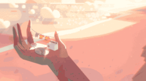
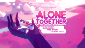
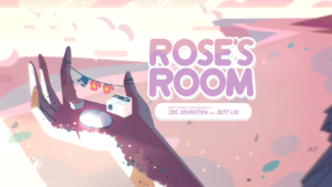 For the majority of the series, the background image was of one of the arms of the temple, with some laundry hung out to dry. I figured it was always the same, but they had three primary ones they would use. They had a daytime, a nighttime, and a dawn or dusk. This, as far as I can tell, shows at what time of day the climax of the episode takes place. On its own that’s pretty cool, but it gets better.” Rose’s Room” has a slight pink hue to it, due to the climax taking place in Rose Quartz’s room. Then “Alone Together” and “We Need to Talk” had a much harsher pink hue, possibly due to the heavy emphasis on the Rose Quartz gem. Then there were even more: some had rain on the beach, one had no ocean, and two had debris from the homeworld ship on the beach. They kept throwing in little things to help set the stage, and then we went to the barn.
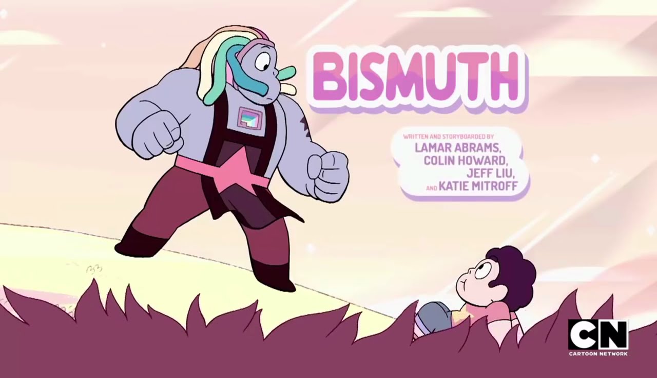
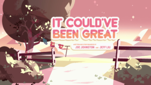 This was the most obvious change, as the background was now laundry drying on a tree, and the field where the barn was. They kept using the time of day themes, but they kept the barn background up until “Steven Floats,” when we came back to the temple. At the time of publication, “Bismuth” is the newest episode, and its title card speaks for itself. It seems the team isn’t done being creative and purposeful with their title cards. Overall, it doesn’t impact the show that much, but it does add just a little something, sometimes without you even noticing. It’s subtle, it’s pretty, and it’s well done. Next time a title card pops up, maybe you’ll give it a second glance; what you find might surprise you.
3 Comments

Hmmm…
*nods
Yeah! Cool. Didn’t notice that.
Thank you, not just for this reply, but all your replies. You’ve been really supportive of my articles, and I should have said this a long time ago. I really appreciate you commenting, and taking the time to read my oft offbeat articles.
I’m not totally sure how to respond to this, but I really appreciate what you said. It honestly feels like one of those YouTube moments where a creator suddenly thanks the one loyal commenter who’s always been there. I kind of just followed a random chain of curiosity — Mike Krol’s music, customizing something, Steven Universe title cards — and somehow ended up here reading your article. It’s wild how the internet leads you places, But I’m glad it did.